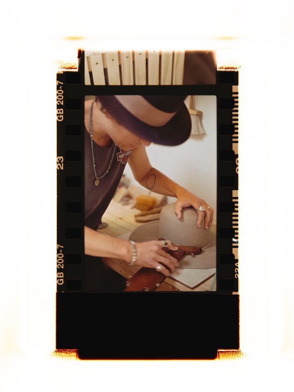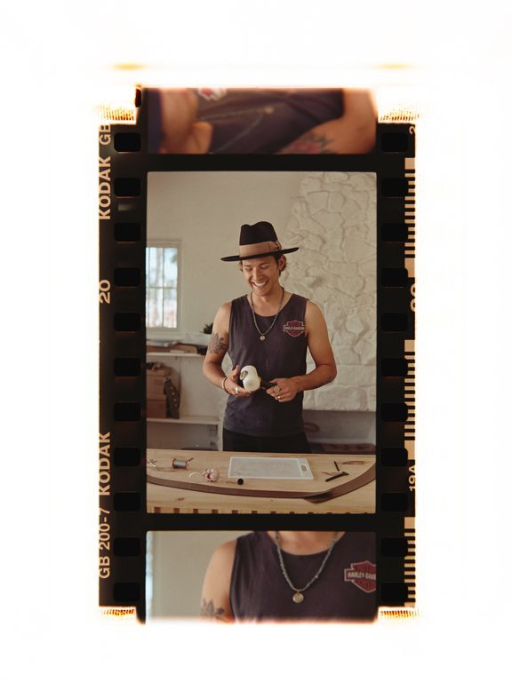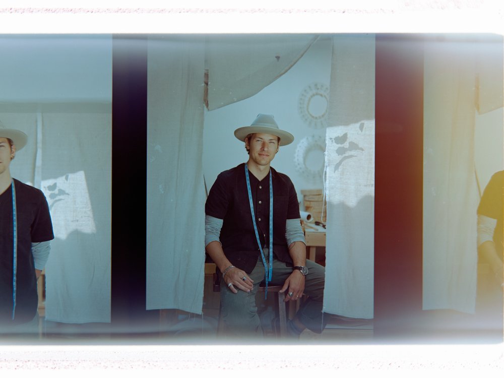

ZITO HAT CO
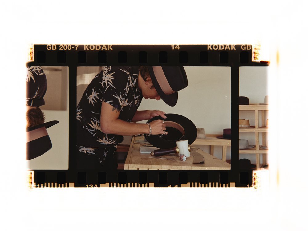
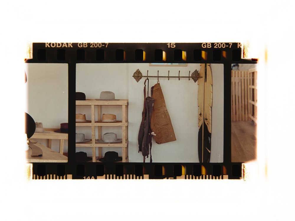
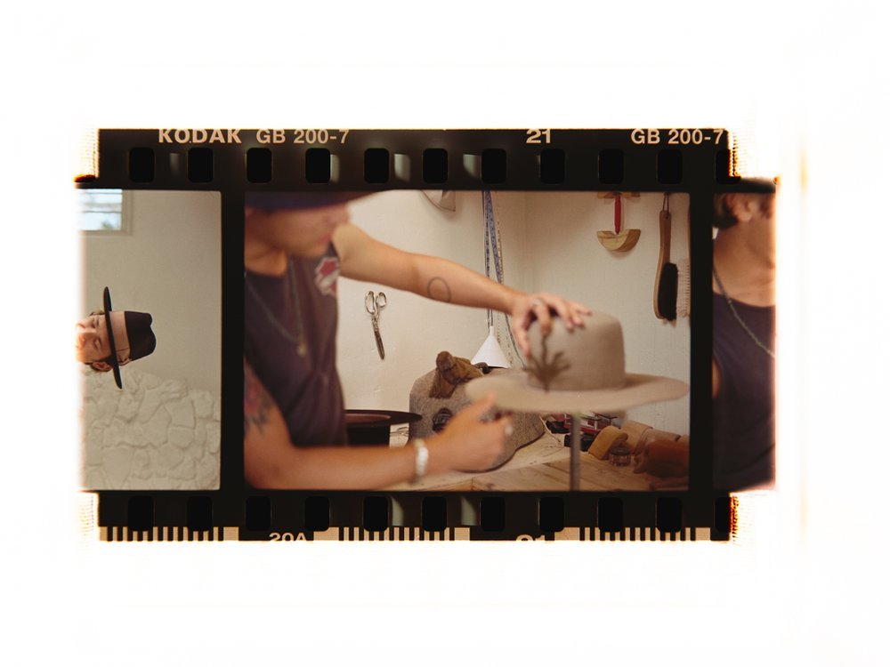
Austin was one of the first people to walk through the doors of Second Place before we had officially opened. He stopped in to introduce himself, and we immediately hit it off. He was getting ready to open Zito Hat Co. just down the street, and it didn't take long before we started sharing ideas and collaborating on projects.
As the business grew, Austin wanted to refresh the brand to reflect its next chapter. Together we updated the logo, redesigned the packaging, created print materials, developed custom hat liners, and designed new storefront signage. The goal wasn't to start over. It was to strengthen what people already connected with and create a more cohesive brand experience.
Watching Zito Hat Co. become a staple in the community has been one of the best parts of the process. What started as a chance introduction has grown into years of collaboration, creative problem-solving, and a friendship that continues to inspire new ideas.


Logo Rebrand
Zito’s hats are all about craftsmanship, each one handmade with a level of quality that speaks for itself. So when it came to designing the logo, we knew it had to reflect that same attention to detail. We really wanted the logo to let that quality shine through, but finding the perfect typeface for “HAT COMPANY” turned out to be more of a challenge than we expected.
After going back and forth with different fonts that just didn’t feel right, Austin had a brilliant idea—why not write it out by hand? So, he grabbed a piece of paper, wrote it down himself, snapped a quick photo, and texted it to me. That handwritten touch was exactly what we needed. I took that picture and used it to create the final logo.